Marit Health Physician Job Match
Context
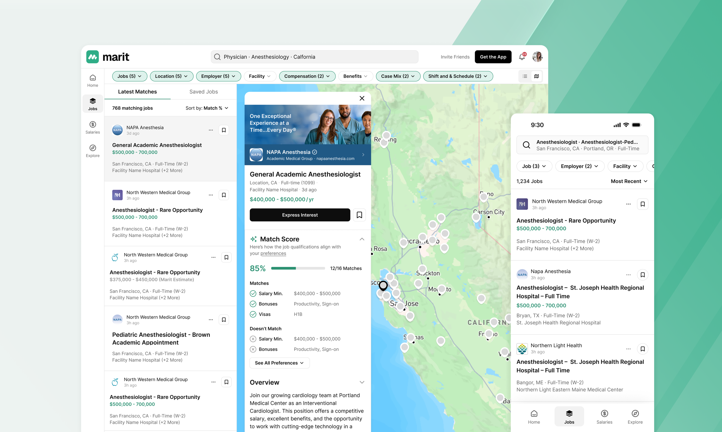
Marit Health set out to create a platform where physicians could track compensation across specialties, discover personalized job opportunities, and connect with peers around shared professional interests. This was a 0→1 product initiative, building from scratch a comprehensive job board, detailed job pages, and a fully functional filter and matching system designed specifically for physicians exploring new roles.
Problem & Opportunity
Recruiting for advanced practitioners and physicians presents unique challenges. Existing sourcing tools often overlook the nuances that influence a physician’s decision to change roles such as community fit, patient demographics, or relocation context.
Unlike other industries, physician openings typically attract very few applicants (often fewer than five) making any expression of interest highly valuable to hospital and clinic recruiters.
By creating a smarter, more context-rich matching system, Marit Health could enable physicians to passively receive tailored opportunities weekly, reducing the effort of job hunting while increasing recruiter engagement and match quality.
Process
Over a four-month period, I collaborated with the Marit team to design and build the new jobs experience, which included:
- Dynamic job feed and job details page
- Filters and preference system for more accurate matching
- Redesigned home feed surfacing personalized job matches
Because the legacy platform was not architected to support features like job boards or social interactions, I also led the information architecture redesign, creating a new navigational framework and extending the design system with reusable components that could scale with future product features.
Research
We began by conducting interviews with partner recruiters from various hospitals to identify their most significant hiring challenges.
Through these conversations, we learned that physicians often lacked a complete picture of what a potential role entailed. While compensation mattered, many wanted deeper insight into:
- The communities they’d be joining
- The neighborhoods they might relocate to
- The patient populations they’d serve.
Existing platforms rarely offered this level of context, leaving physicians uncertain and less likely to engage. These insights shaped our product direction, emphasizing rich job context and trust-building transparency throughout the experience.
Outcome
The Jobs on Marit platform launched in September 2025, rolling out across Web and native iOS and Android apps. This release not only expanded Marit’s value proposition for physicians and recruiters but also set the foundation for the next evolution of the product, a social layer that allows physicians to connect, collaborate, and share insights directly on the platform.
See the full case study here
Handshake Candidate Profiles
Problem
Handshake hosts thousands of student profiles across multiple employer touch points—but profile layouts vary, with 2–3 inconsistent formats. This inconsistency confuses recruiters, making it harder to scan and compare candidates efficiently, especially in long lists. Moreover, the student-facing profiles look different from what employers see, creating a disconnect between both sides of the marketplace.
Opportunity
To improve clarity and consistency, our goal was to ensure recruiters always see the most relevant candidate details upfront—no matter where profiles appear. This meant rethinking not only the profile page but also list views, feeds, and preview cards. We saw an opportunity to enhance both the structure of candidate data and the browsing experience across match lists, search results, and event sign-ups.
Process
I led design efforts on the employer side, partnering closely with designers from the design systems and student teams. I created key components to reflect the new profile structure and collaborated with the design systems team to determine where to reuse or introduce new elements. My design partner provided insights from the student experience, ensuring alignment across both products. Throughout, I worked closely with my PM—from writing the PRD and synthesizing research to preparing handoff materials for engineering.
Research
We began by reviewing existing research, leveraging prior recruiter and SMB interviews conducted by our UXR team. These insights revealed what information recruiters value most and where friction occurred. To validate and refine our approach, we ran a focused study asking recruiters to rank profile details by importance. The findings directly informed our content hierarchy for highlight modules and preview cards.
Outcome
The redesigned candidate profile launched in Q4 2024, driving a 20% increase in message sends within the matches experience. The success validated our design direction and set the stage for upcoming improvements to list views and browsing across the employer platform.
See the full case study here
Jobs on Blind
Problem
Blind has always been a platform for tech workers to talk about work, company information research, and finding new opportunities in the industry. However Blind as it stands is limited to research alone, with no way to take any action on companies or open roles that they see being talked about on the platform. Many job seekers end up asking for referrals or open positions through organic posts, which most of the time do not lead to any help or results.
Opportunity
We realized that there is a very clear opportunity here to connect those who are researching and looking for jobs directly with the most popular companies and their open roles on Blind. Furthermore, by creating a job board on Blind, these jobs can further fuel the conversations between our users when they are comparing / contrasting offers and pay ranges with each other.
Our primary measurement of success on the consumer side is job views / sessions per week, and on the b2b side, the amount of jobs we can pull in from either existing job boards or new roles directly from internal recruiters.
Process
I managed the design teams work across the b2b and b2c side of jobs, where I personally worked on building out the consumer side of the experience, and had 2 designers on my team building out the b2b jobs portal. The consumer experience was focused on browsing, filtering, and searching for open roles, while the b2b side was focused on job post creation as well as importing existing roles from platforms like greenhouse where roles may have already been setup.
Research
To make sure we’re building the best experience possible for our job seekers, and to improve upon what they are already using out there, we ran UXR sessions with 7 participants. The participant pool was made up of a mix of individual contributors from juniors to more senior IC’s and 2 people managers. Roles were primarily software engineering based since that’s our majority on the platform, with 3 candidates in design and product.
We learned pretty early on that participants disliked reading through job posts, and find it hard to find important information that helped them decide whether to apply or not. In terms of ranking, we learned that some of the most important pieces of information includes compensation ranges, workplace policy (Remote or Hybrid), required YOE, and finally tools that the role uses. This was especially important for engineers who need to know what coding language is used on the team.
“I don’t tailor my resume for each job, instead just look for jobs that match my skills (java, docker, etc)”
Other learnings that were just as important were how happy people currently working at the company are, both on a company and team level.
“I wish there was a place where testimonials are there for teams. If there's a large number of happy people at a company, usually it's a good chance that the company is not toxic”
Outcome
We launched our first version of the jobs feed that drove a 45% increase in job post views compared to our test feed that Blind Korea launched a few months prior to the US release date.
Have since added 20,000+ open roles on the platform.
Helped the company raise an additional 15m in funding due to the new jobs experience and business line.
See the full case study here
Blind Compensation / Equity Tools
Problem
Blind users are using the platform to compare job offers, market rate compensation, and research prospective companies. However at the time, Blind had a very simple and limited tool for salary comparison that did not encompass the complexities of comp packages at most companies. Furthermore, users would ask for compensation information on posts when it’ sometimes irrelevant due a lack of home for compensation and equity tools.
Opportunity
Due to the immense interest around compensation, there was a very direct way to connect the needs of ours users with a more robust compensation / equity comparison tool. This also provided a gateway for us to collect compensation information in a more systematic way; improving the quality and depth of the data we can show.
Research
Conducted 3 rounds of UXR with users of Blind for both the data visualizations as well as the compensation input flows. Generally participants found the data visualization very useful, and would use it to during job search for viewing comparable offers. Participants understood the give-to-get model from the start, and was ok providing their own information first. Similar to other services like Glassdoor and LinkedIn.
Some of the recommended changes and findings we iterated on included clearer message and controls for how users indicate vesting schedules during input flows. Allowing users to break down weighted vested schedules by percentages made a big difference comprehension. We’ve also simplified the page for filtering where all modules are filtered with controls only at the top. There are no filtering controls for specific modules.
Outcome
Designed and shipped the initial total compensation tool within 4 months. Since then we’ve collected 15,000+ salaries from FAANG to startups over a period of 1.5 years. Our users have been not only using the data, but we’ve also publicly shared our data to the rest of the tech community via published infographic / posts for others outside of the platform to see.
The design language from this project was also applied to our core design system. Primarily the overhaul to the 8pt grid that was used along with additional components for filtering controls and data visualization templates.
See the full case here
DoorDash In App Chat
Problem
Dasher and Consumer communication is key to successful deliveries. Among other thing, it primarily facilitates successful deliveries at difficult drop-offs, and sets expectations when order is getting delayed. At the time of the project, the entry point is in app however the actual communication happens outside the app via phone calls/text messages (actual phone numbers are masked by Twilio). This takes the experience outside our control and exposes our users to a variety of reliability issues that are inherent with those channels like message latency and no send / read receipts.
Opportunity
By creating an in app / native communication experience we can increase successful contacts rates between Dashers and Consumers which in turn can help reduce delivery errors like “never delivered”. By making it easier to initiate conversations between the two parties, there’s an opportunity to improve CSAT ratings, and reduce contact rates to our support teams as well. And lastly, by building the first ever chat system within DD, other teams across our marketplace can potentially leverage chat across their use cases as well ie: chat with support agents or merchants.
Research
Some of our key takeaways from usability testing included participants feeling that the new chat experience was positive and simple. All participants when shown pre-canned responses understood how they were used, and compared it to that of other services like messenger and gmail that uses a similar prompt.
Participants also mentioned that finding the entry point for chat was easy, and that it was contextually closer to where they were looking for their Dashers information on the tracker card.
“Usually I receive texts to my direct cell number from the drivers random number, I much prefer having the convo happen in the app.”
“I will be very comfortable sending an image that would make the delivery process easier. I know that my personal information is protected because I am communicating with the dasher via the "Doordash" app so it is secure and safe to use.”
Results
The feature drove a clear reduction in our primary metric - Never Delivered Rate decreased by 0.05% or 11.25% relative. This translates to $11.5M in annualized cost savings.
This was primarily driven by creating an easier communication experience for Dashers and Consumers and a faster, more reliable communication channel
The percent of text messages successfully delivered increased from 83.3% to 93.8%, and the percent of delivered messages with < 1 minute of latency increased from 92.4% to 99.0%
Pinterest video ads
Goal
To build on the success of video in its first year and 2x its growth in 2018. The goal is to expand the format’s ability to help advertisers tell their stories, with an explicit sub-goal of capturing brand awareness budgets.
Problem
We believe video on Pinterest must transform significantly to achieve our goals. There are three axes on which video could improve significantly:
Surfaces - Due to insufficient and limited placement, it is difficult to elevate premium video content over other videos for brand concerned advertisers.
Pin rep - Our basic square format forces widescreen videos to be cropped and discourages the creation of vertical videos, currently the most popular format on mobile.
Behaviors - Video capabilities on the platform are limited to a “play, pause” modality, making it not very actionable for Pinners.
Process
- Pre project kick off explorations
- Early concepts to help guide xfn team on feature framework
Messenger camera
Goal
Build a scalable social camera on Messenger that enables people to express themselves via content sent to thread or to stories.
Problem
Phase 1:
The inherited problem with the messenger camera revolves around the clarity / placement of tools and a system that doesn’t scale well with new tools being added in.
Scalability - Messenger camera started out with limited and simple editing tools. However, as the amount of features and tools grew, we needed a better IA that could grow with the tools that we are introducing.
Phase 2:
Alignment with FB product suite - After the first design and interaction study, we shifted into making sure that the camera was aligned with how people expected to use other social cameras within the FB family of apps. Since Instagram’s camera was what people were used to most for content posting and story creation; we aligned parts of the camera to bring back a sense of familiarity between the suite of apps.
Camera capture clean up - We realized that the second iteration of camera wasn’t giving the new camera modes the highlight and room it needed to perform. This was due to the controls and mask effects competing for attention, so we began by cleaning up the view on the initial capture screen through hiding the masks under a button / tap.
Results
Phase 1 testing -
image editing from thread view went up 3.2%
Post capture AR mask usage up 2%
Phase 2 solution -
Finished camera redesign alignment with other FB social cameras ie: IG
End to end camera flow that incorporates iOS system components when possible to reduce the use of custom components and app size. The new camera design is now integrated into the larger Messenger Lightspeed rewrite to improve performance and reduce app size overall.
Process
- IA audit
- Interaction study
- cross product alignment
- usability study
Pinterest: One tap ad
One tap is the bread and butter ad format for direct response advertisers on Pinterest. These ads are made to efficiently drive Pinners to the Partners site as quickly as possible, while still providing value up front to inspire Pinners to take action.
Problem
The first version of one tap had a few issues with the experience for both Partners and Pinners. On the Pinner side, the creative was lost and taken away when the site loaded into view. This made it difficult for Pinners to really look and evaluate the creative that they are used to viewing on a regular closeup. For Partners, they were seeing a dramatic increase in CTR, however, conversions were neutral to down. The theory is that Pinners were clicking in, and backing out instantly due to the poor transition from home feed to the site.
Goals
- Increase click-throughs
- Provide a better viewing experience for Pinners when transitioning into the site
- Define a better success metric that accurately logs high intent clicks into the site
Process
V2 - In this version, the ad creative stays on click, resting right above the site. Pinners can now view the image for as long as they want, and when they're ready, scrolling up would take them directly to the site.
Metrics changed from direct click-throughs to gCTR (good click-throughs). Good clicks were defined as 3 seconds or more on the site, which helped push the quality of the format, along with moving away from empty clicks.
V3 - The third version of one tap was focused on bringing a more immersive and premium feeling to the format, along with driving up good clicks. This was done by keeping the website in view, no matter the height of the ad creative. Depending on the height of the image, the website would either be shown in a larger view or stay sticky as a footer at the bottom.
Results
Click-throughs went down, however, gCTR went up by 2% along with conversions. This essentially meant that we were getting more qualified clicks. There were less Pinners going into the site, however those who went into the site spent longer sessions browsing and converting more often.
Pulse Mobile
The project was to turn Pulse from a news aggregator to a more relevant and personalized stream of content. Instead of displaying a long condensed list of articles to sort and parse through, the idea is to focus on larger more visual content pieces that show reasons for why someone is seeing what they are seeing. The reader page has also been redesigned with serifed type faces, and larger cover photo experiences to help bring each article to life. Some of the bonus features in the redesign, includes an easy to tap reader (scraped) view that takes 3rd party articles and scrapes the text into our own template design.
Process:
The lead designer and I split up the work between the product, where I focused primarily on the reader page design. Along with owning the reader page, I assisted with feed / header transitions and design alignment. One of our major goals during the redesign was to also align our animation and design elements with the rest of Linkedin's content products.
Deliverables:
-Reader page interaction patterns
-high fidelity reader page mocks and specs
-interaction prototypes for feed and reader page
-design sync of mobile reader page with desktop
Linkedin: Profile completion
Helping users complete their profiles to get better engagement with recruiters on the platform.